Lunch Mob Redesign
Redesigned the Website for A Local Lunch Service
TEAM


ROLE
Designer & Researcher
type
Class
Project
Project
2019 | MAR - JUN
Our main goal in this project is to determine whether our redesign successfully addressed the problems our potential customers described. We want to foster a better relationship with parents by building trust through better presentation of reliable information, a more visually pleasing aesthetic design with a consistent color palette and less fonts, and make navigation through the website more seamless by using standardized affordances.
Lunch Mob redesign is what I have worked on for a team project Camp Izza redesign.

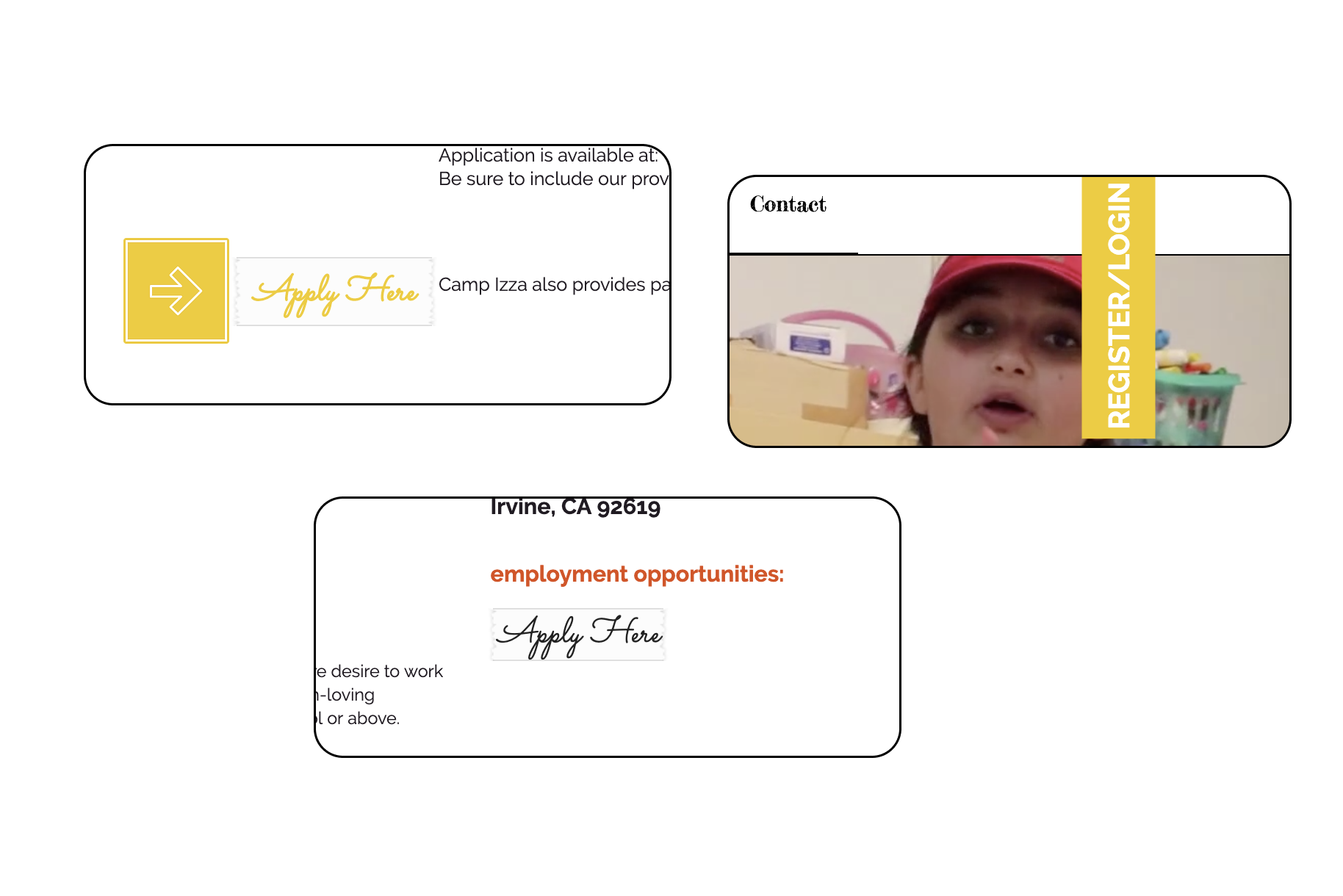
Redesigned Lunch Mob final deliverable


.svg)
Our interview methodology consisted of phone interviews lasting anywhere between 10-20 minutes depending on how in-depth the participant’s answers were. For the interview questions, our team got together a week before interviews were scheduled and came up with a list of 10 interview questions. The questions focus on the participant's preferences pertaining to child care services and if the participant has ever enrolled their child in Camp Izza. From the collected data, we extracted three personas based on our participants’ occupations, child care services preferences, and their knowledge pertaining to Camp Izza’s programs.
Data analysis was done by extracting information from both the interviews and the survey answers to create a comprehensive list of the main concerns with the Camp Izza website. These concerns will be discussed during the redesign process to ensure that the user is being taken into account at all points of the site’s redesign. Many of our survey questions contained screenshots of the site asking participants what they thought of how the information is currently displayed. The answers to those questions will guide us through the redesign process as we find the most efficient way to display Camp Izza’s information throughout the site. A chart including a summary for each participant is included in the survey log section under Appendices.
The second method we utilized to gather information was through conducting a survey through google forms. It is a mix of open-ended and closed-ended questions, ranging from yes/no to rankings. By asking our interview participants and their web of connections, we gathered around twenty respondents. It is an anonymous survey that detailed our potential users’ demographics, aspects that they liked about the website as well as aspects they disliked. The final portion of the survey asked our users for more suggestions that we kept in mind when approaching our redesign.


Survey results about financial aid from Google Form.
Based on the findings from surveys, I created an Affinity Map using Milanote

Final affinity diagram I created.
Upon completion of the cognitive walkthrough and usability tests, our group was able to pinpoint the primary usability issues in relation to the Camp Izza website. The first usability issue is that many users found that the buttons have non-standard shapes and are hard to understand. This causes confusion on where users are supposed to click on the site (see Image 1). The square line seems to blend in the background, almost appearing as part of the page instead of signifiers that allows users to navigate to the correct page. We suggest that the buttons appear more clearly with a shadow or clear border to differentiate them as affordances rather than as non interactable pieces of the webpage.
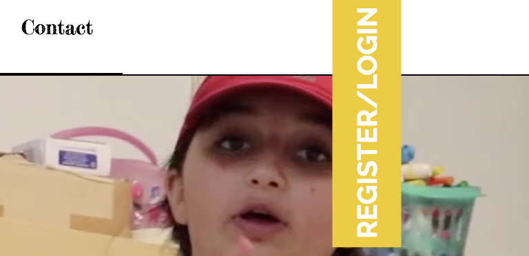


Usability Issue with recognizing clickable buttons
Usability Issue with recognizing clickable buttons
Target 1: Create a more consistent visual design (fonts, buttons, and color palette)
Problem: Currently, there is a lot of inconsistency in the visual design. For instance, the buttons are unusual shapes, inconsistent with standard buttons seen on other websites. This makes it hard for users to understand what they can click on, which in turn, limits their accessibility to resources like the camp’s financial aid or the employment application. In addition, there are too many fonts used in both the website itself and in graphics displayed on the website, creating an overwhelming experience. Similarly, inconsistent and highly saturated colors add to the overwhelming feeling.
Evidence: Most of the feedback received from the conducted interviews and usability tests had a common theme of users not liking the website’s visual design. Many users complained of not liking the website’s color scheme because the bright colors distracted from the site’s content. Many users were also confused by the site’s buttons because they lack certain characteristics that other sites use when designing buttons such as shadows to indicate that a button is clickable. Fonts also play a role in the users’ dislike of the site’s aesthetic because a variety of fonts are used on a single page making the page look more incohesive. With all this feedback on the visual design, we decided to make this a target since we believe redesigning the visual aspects of the site will greatly enhance how users interact with the site. Visual design is usually the first thing users notice about a website or application which is why it is important that we create an aesthetic that correlates with Camp Izza’s message.

Users expecting to see more information/content about the activities.
Target 3: Include more details about the camp’s services
Problem: There is a lack of information about the camp and its services, which discourages parents to enroll their child in the camp.
Evidence: Through interviews, surveys, and usability tests, we have concluded that it is difficult for users to find certain information about Camp Izza and the services offered. The results from the survey conducted in Assignment 2 show that users can not get a clear understanding of Camp Izza’s purpose due to the lack of information presented. Due to the lack of understanding, some users said they would not feel comfortable enrolling their child in a program. In many of the interviews parents said they want child care services that are trustworthy and reliable. Having a site that has a lack of information makes it difficult for parents to trust the camp since there is no layout as to what activities the children will be partaking in and a lack information about the camp’s purpose. This was chosen as a target because we feel that by including more information about the camp’s services that users would feel more comfortable enrolling their child in the camp. Information inclusion could possibly increase business for Camp Izza as it will give users more details about the camp and its services.
We also wanted to create a style guide to make sure fonts, colors, and other assets were consistent across our designs. Xiang made a style guide with fonts, colors, the header, logos, buttons, and cards. This style guide was crucial for the redesign because it made designing the pages a lot more efficient by allowing us to copy and paste assets like the header, logo, and buttons into our page. Xiang updated the style guide throughout the process. See Image below.

Style guide
.jpg)
Lunch Mob design sketch
To start the project, we completed a competitive analysis to learn more about Camp Izza’s direct and indirect competitors. Through this, we were able to see how different camp websites organized and presented their information, as well as how each website represented their brand. Next, we did research on the users through surveys and interviews. From this data, we created personas to help represent various types of users, such as grandparents, single parents, and married parents.
The next step was to complete usability testing of the website. We had five participants each complete five tasks: register an account, contact the camp, apply for financial aid, enroll a child, and find information. Through this, we learned that some information was hidden or hard to find, which impacted participants’ willingness to enroll their child in the camp. Cognitive walkthroughs for registering for an account, applying for a job, and finding a particular activity allowed us to examine user flows more closely.
Finally, we redesigned the main pages of Camp Izza’s website, taking into account everything that we learned. We updated the website to have a more modern visual design, made site navigation easier, and made information more accessible and detailed. A heuristic evaluation using Nielsen’s 10 Heuristics was completed on the redesign, as well as an accessibility evaluation on the original site. We believe that our redesign substantially improves the current Camp Izza website and would increase client interest and retention in the camp.

Redesigned Lunch Mob final deliverable
